Welcome to Visual Vocab: a series dedicated to the language we speak in visuals. Whether you’re building a brand, designing a deck, or directing a shoot, knowing how to articulate your taste is a kind of power. These are the foundational tools, composition, light, color, shadow, scale, that shape how we see and how we’re seen.
Let’s start with a classic: negative space.
Also known as white space, negative space is the area around and between your subject. It’s not the “nothing”, it’s the frame. The breath. The silence that makes the music work.
In photography and design, negative space does a few things:
It gives your subject room to exist.
It directs focus; our eye goes where the clutter doesn’t.
It creates tension, often more effective than filling every inch of the frame.
It feels elevated. Confident. Minimal without being boring.
Think of a Céline ad under Phoebe Philo: one model, one look, one moment. Or a product photo on a stark background. The restraint is the luxury. The space says, “we don’t need to shout.”





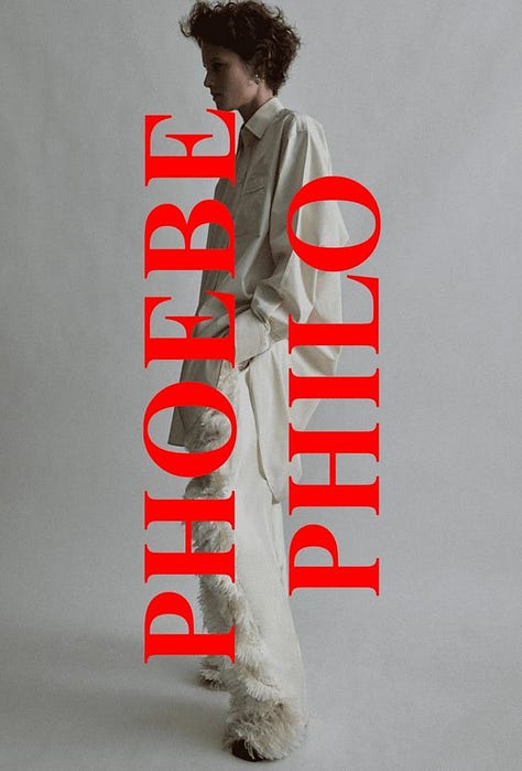



Negative space can also say something. Is your subject isolated? Heroic? Dwarfed by their environment? Alone? The way you position your subject relative to the rest of the frame tells a story.
Start paying attention to what’s not in the frame. The emptiness might be doing more work than you think.
Your homework:
Screenshot an image you love that uses negative space.
Ask yourself: what does the space do here? How does it shape the story?
Try it out in your next layout or shoot. Pull back. Leave room.
Sometimes the best design decision is what you choose not to add.


